HOXY’s Dot Com
Building a digital home for a growing seasoning brand
HOXY™ is an emerging food brand known for its flavorful seasoning blends, gaining momentum through third-party platforms like Amazon and Walmart. While these channels offered initial exposure, the brand lacked a dedicated space to express its identity and engage directly with its customers. This e-commerce website serves as HOXY™’s first branded digital touchpoint—designed to establish brand presence, drive customer loyalty, and lay the foundation for future marketing and awareness efforts.
01- Research Process
Opportunity
While HOXY™ was gaining traction through third-party platforms and food expos, it lacked a branded digital space to connect directly with customers. As the brand grew, there was a need to create an e-commerce site that could express its identity, support direct sales, and serve as a foundation for future marketing plans.
Market Research
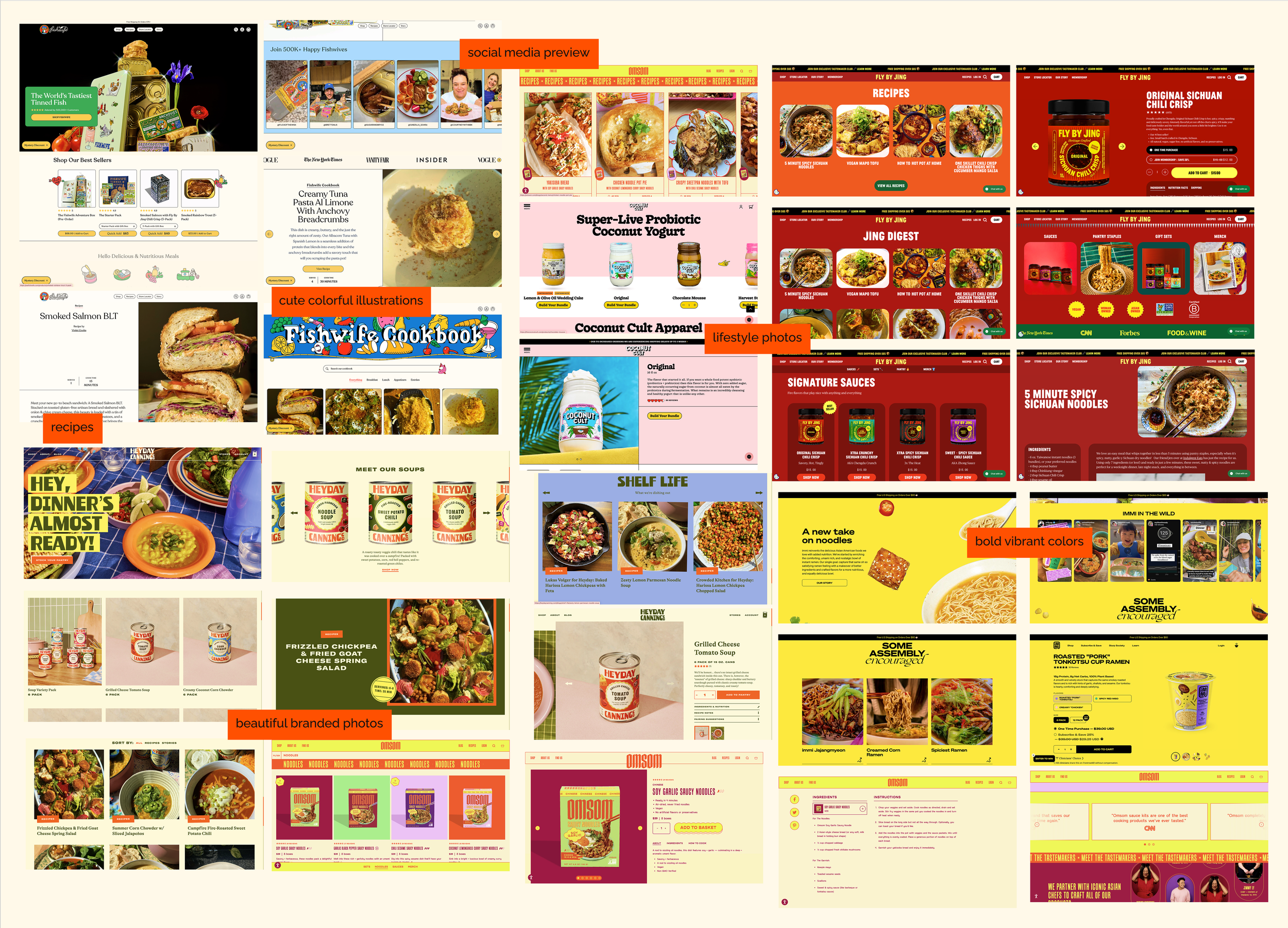
I explored the digital presence of both direct competitors (other seasoning or pantry brands) and aspirational food/lifestyle brands. I looked at elements like visual branding, product display, homepage layout, and mobile responsiveness. This helped identify common patterns, missed opportunities, and user expectations around food e-commerce experiences.
1- Strong storytelling helps small food brands stand out
2- Best-performing brands had “recipes” or “how to use” content that created lifestyle value and helped create a community of followers
User Expectations
I conducted informal user feedback to identify what people look for when shopping for food products online. Even simple input from peers and test users helped clarify needs.
Some key takeaways
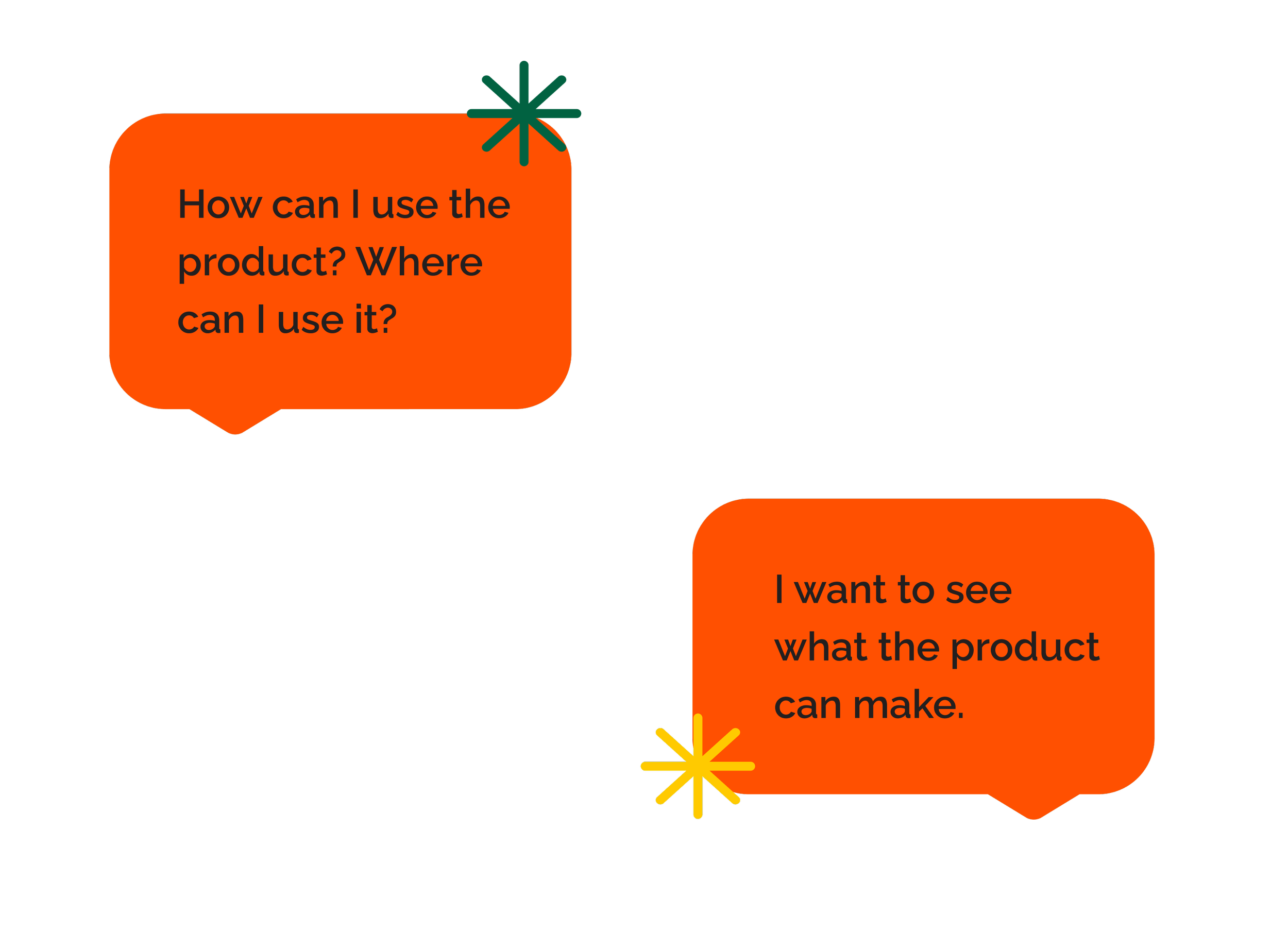
Users want to understand flavor profiles and how to use the product.
Education is key.
Visuals are essential—users expect clean, high-quality images (especially lifestyle photography). It helps establish brand trust.
User Expectations
I conducted informal user feedback to identify what people look for when shopping for food products online. Even simple input from peers and test users helped clarify needs.
Some key takeaways
Users want to understand flavor profiles and how to use the product.
Education is key.
Visuals are essential—users expect clean, high-quality images (especially lifestyle photography). It helps establish brand trust.
03- Design
The Look & Feel
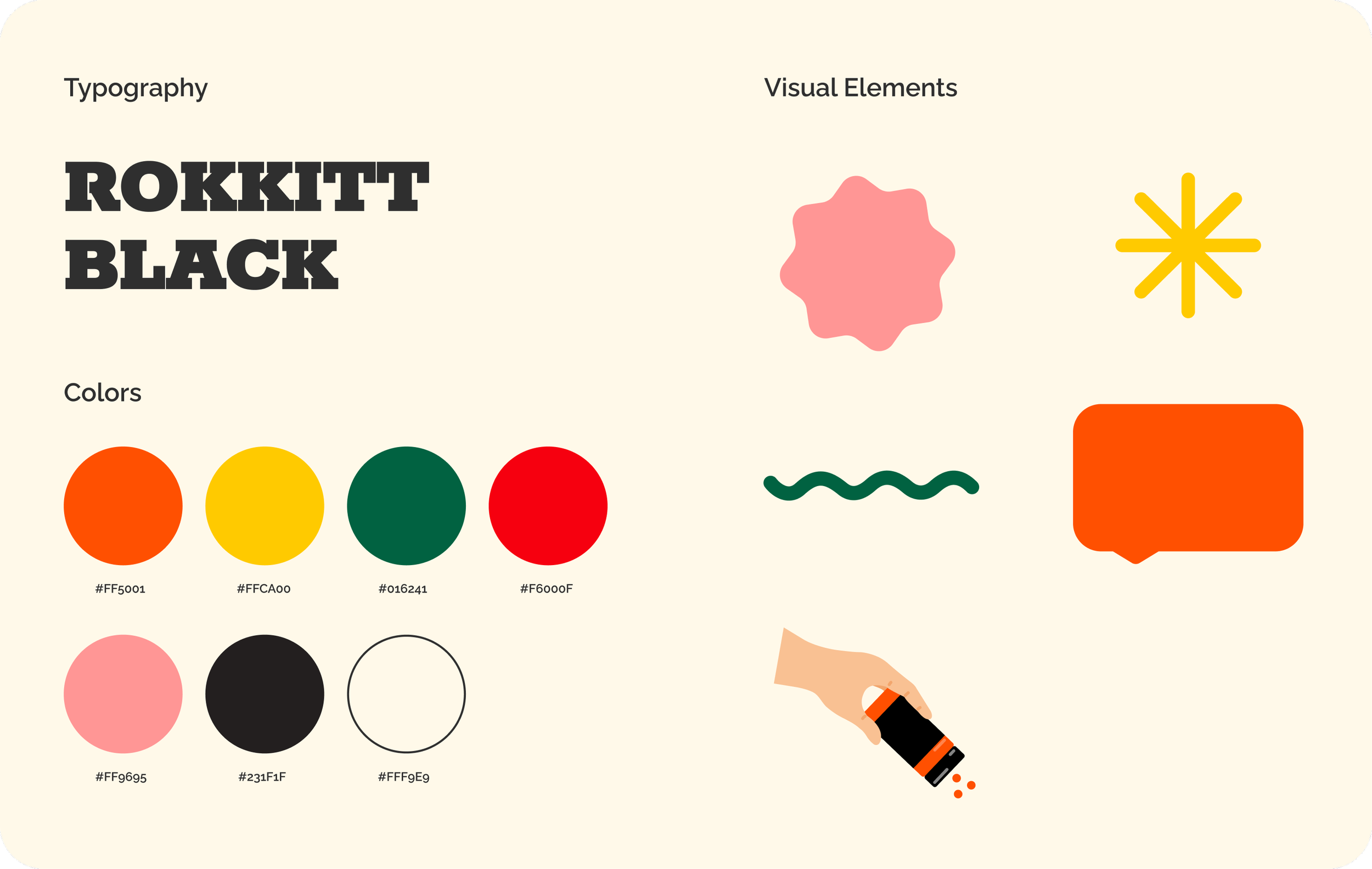
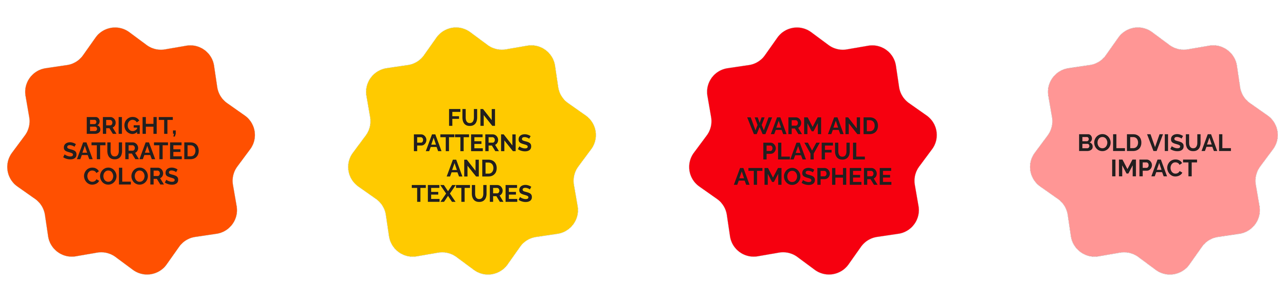
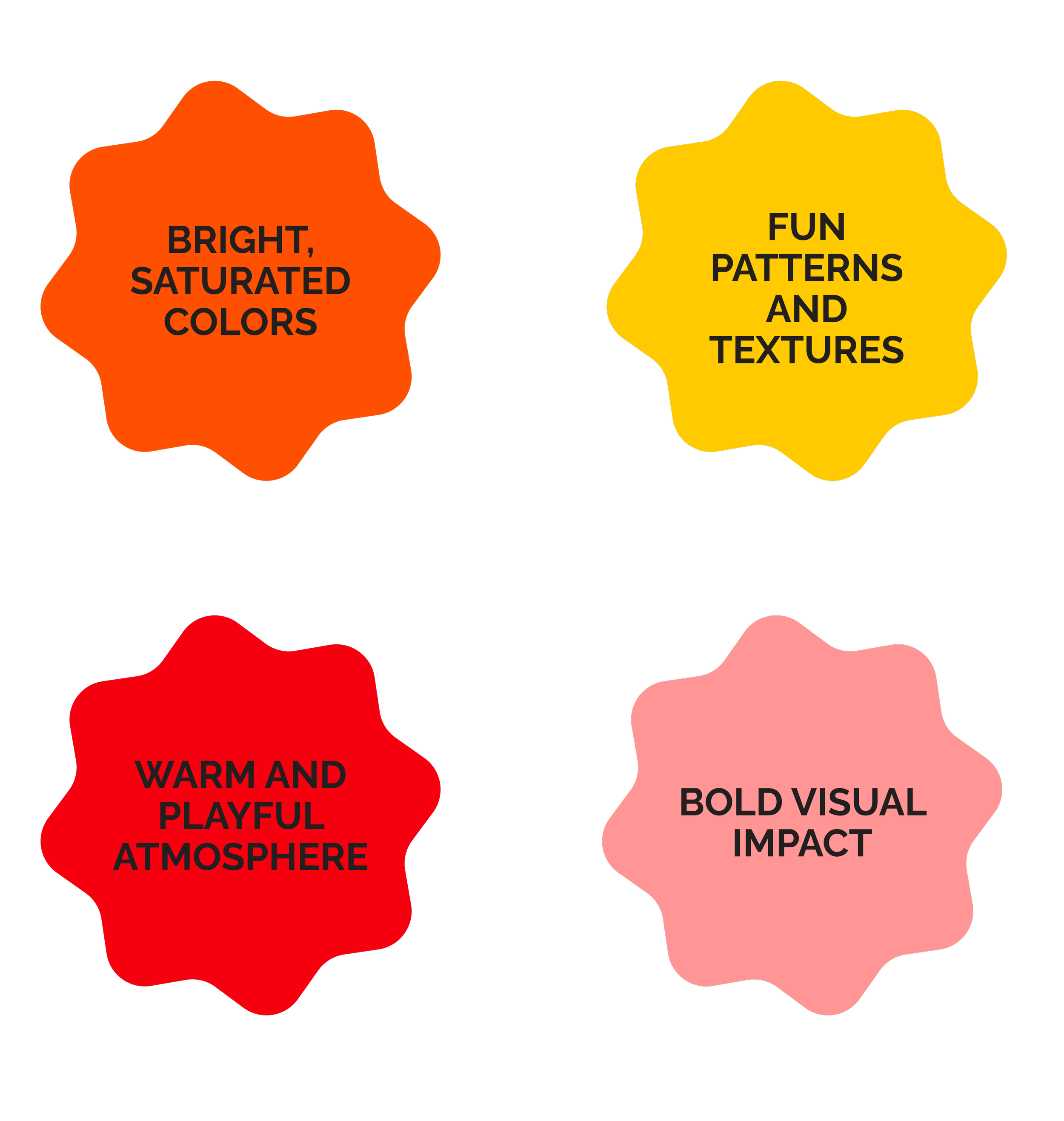
HOXY™ already had a recognizable brand identity defined by bold colors and playful patterns. As I helped develop the brand’s digital storytelling, I expanded on this visual language—introducing complementary elements that enhanced the brand’s voice without straying from its core personality. While many food brands lean on cultural heritage, HOXY™ targets a broader audience that may be less familiar with Korean cuisine. The visual design needed to feel exciting, inclusive, and fresh—bridging the gap between cultural authenticity and mainstream accessibility.
02- Design
Photoshoot Direction
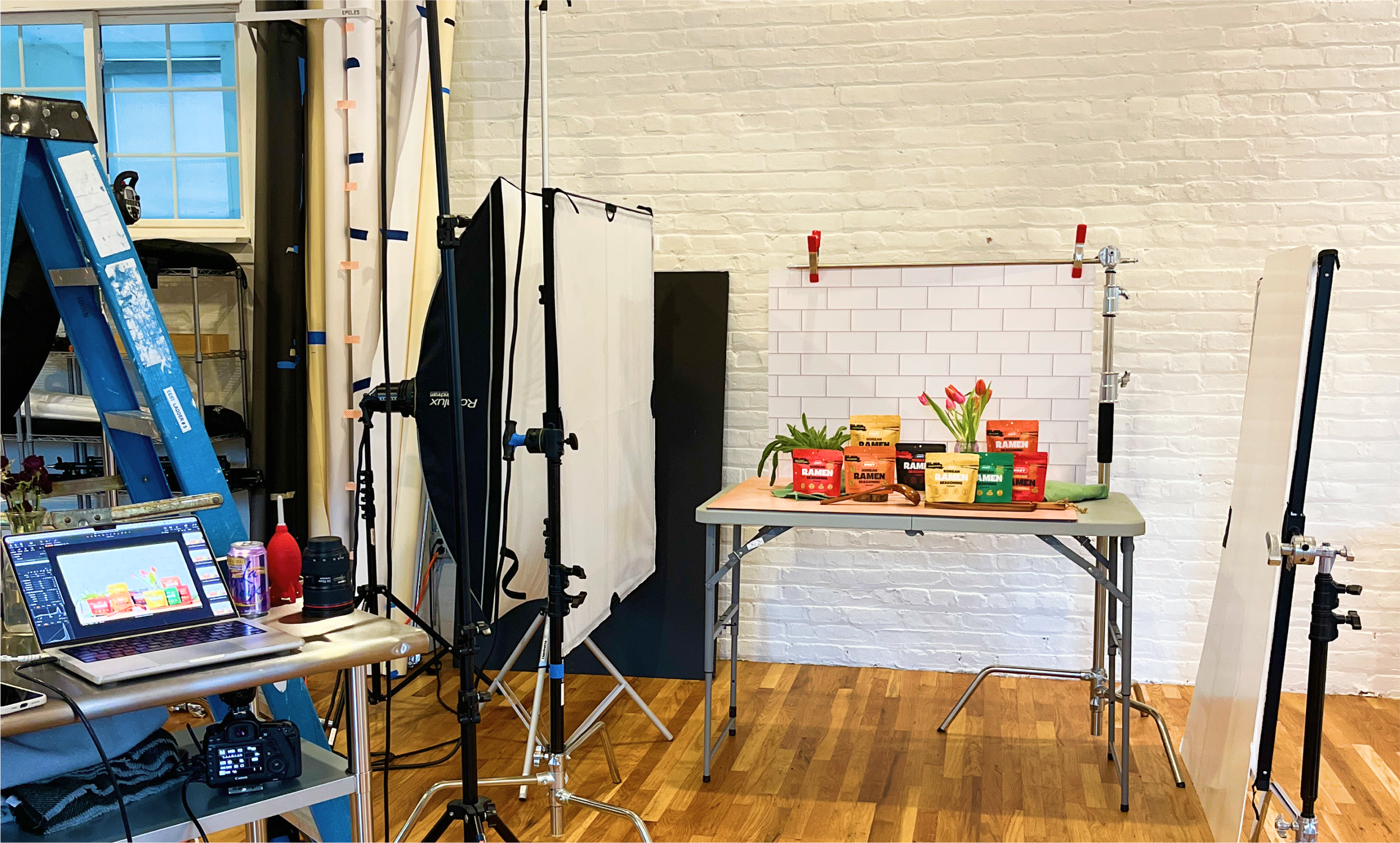
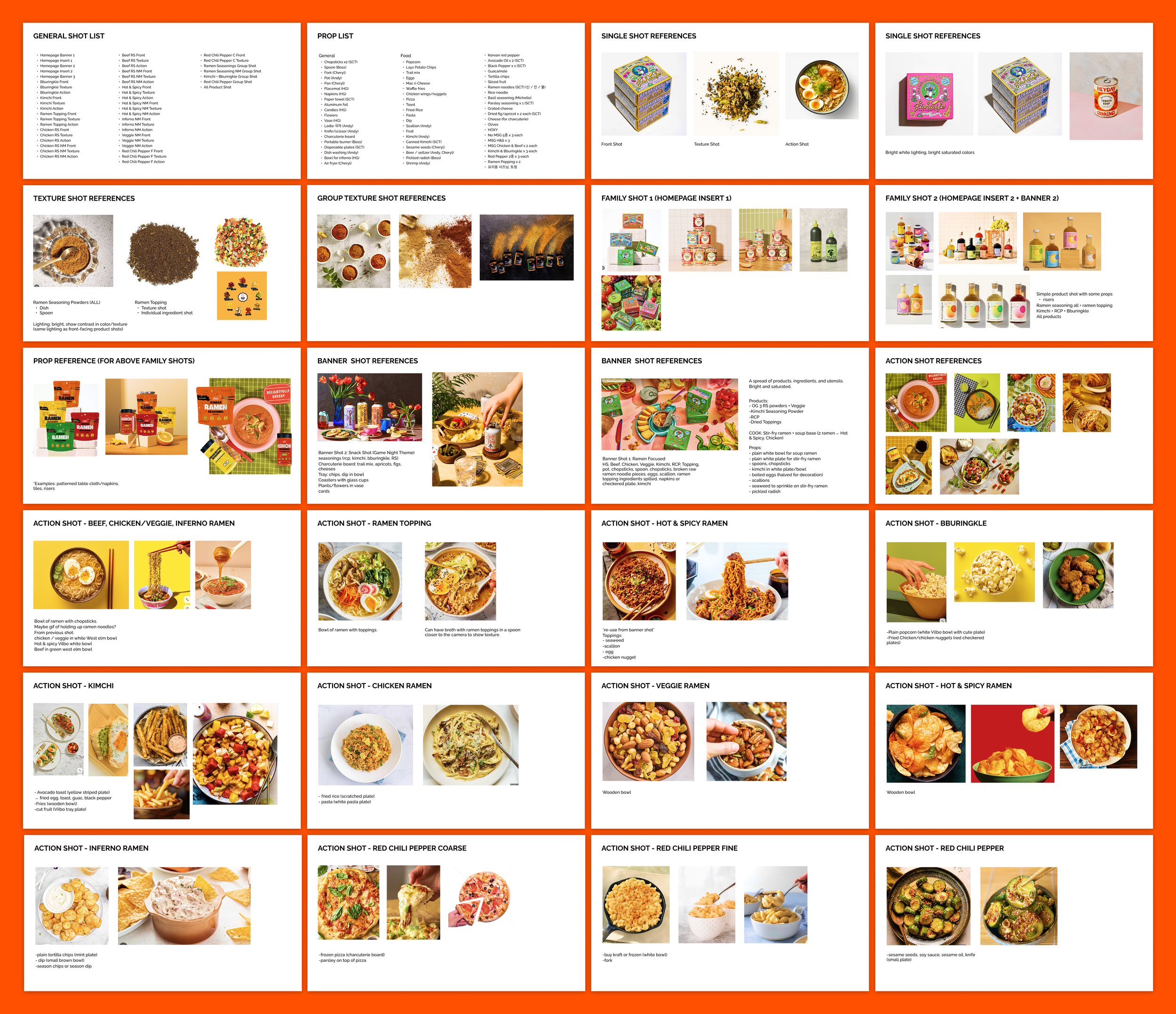
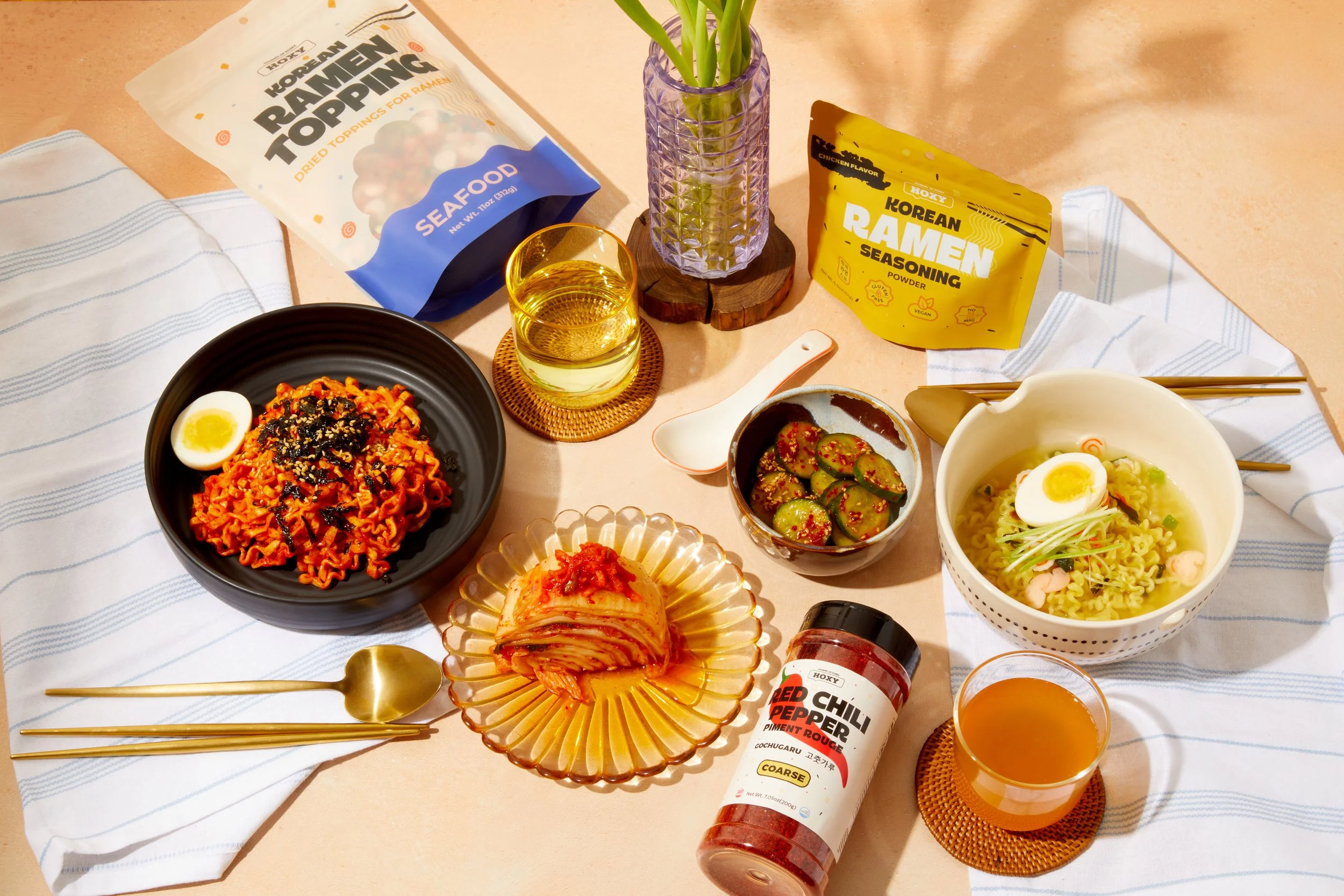
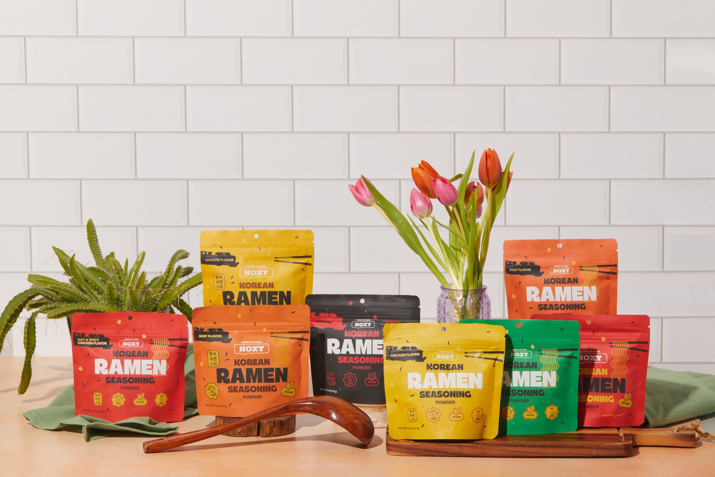
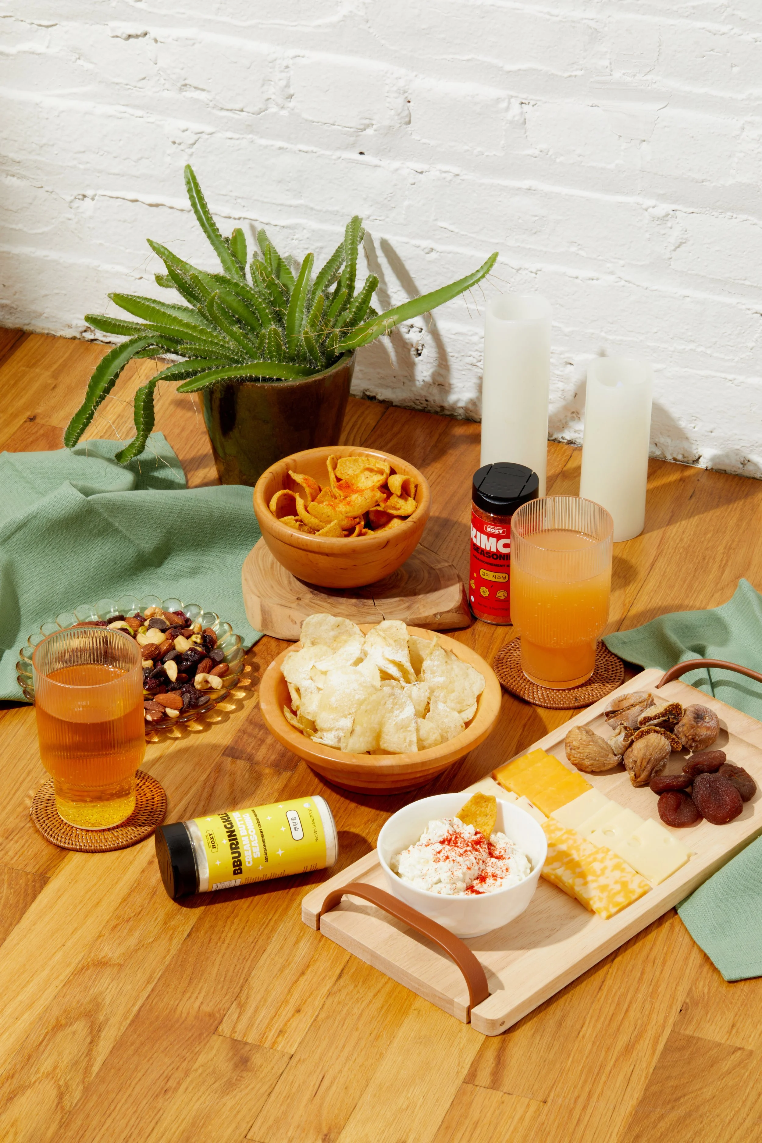
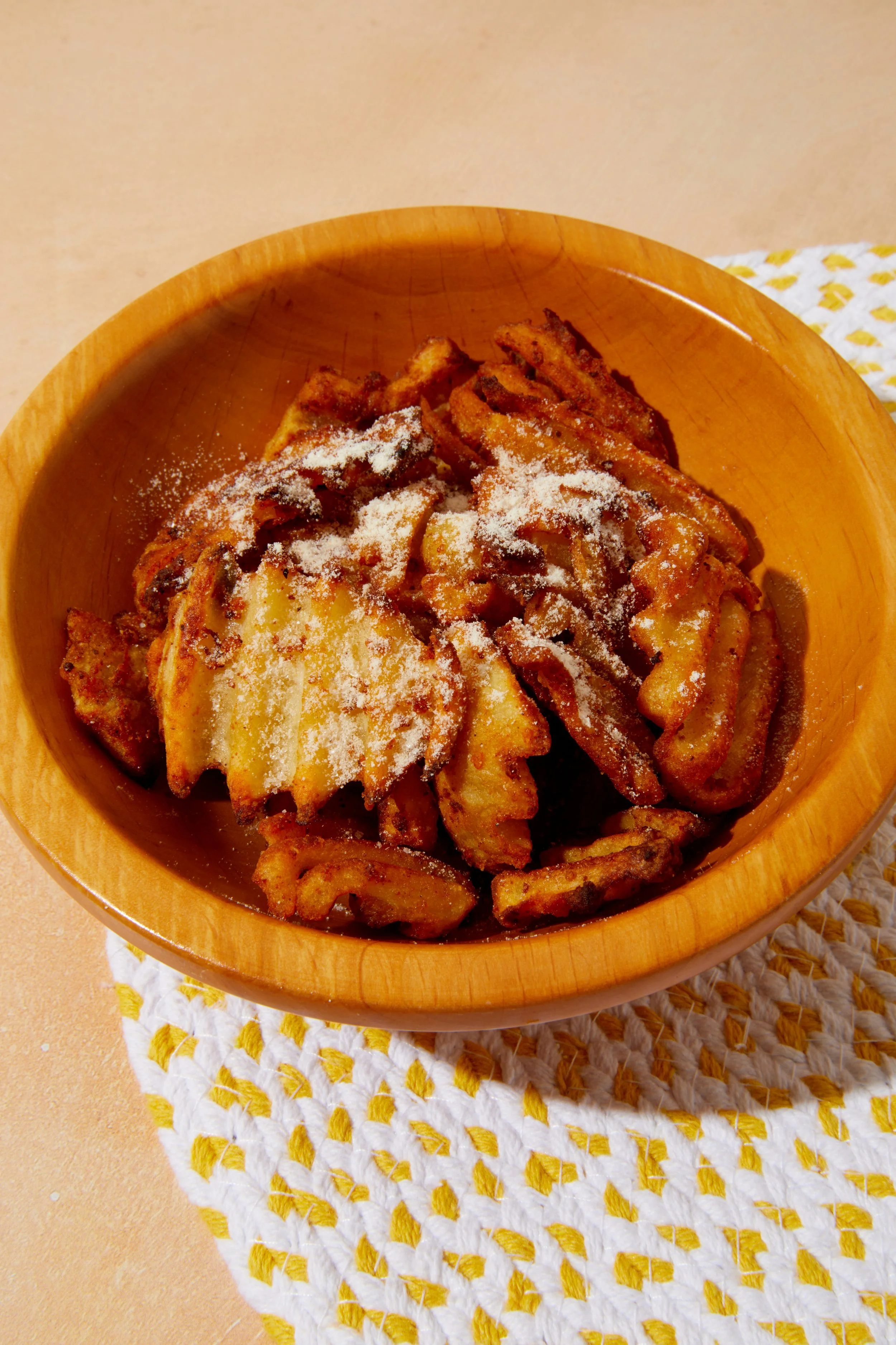
User feedback and research indicated that strong, consistent visuals were crucial to establishing credibility and brand trust. Previously, we relied on doctored stock images to represent HOXY™—but this limited the brand’s ability to express its identity.
I collaborated with the business and brand strategy team to plan and art-direct our first official photoshoot. I developed a creative deck to communicate the desired visual tone, color styling, and composition. This direction allowed us to showcase the product in lifestyle contexts, highlight its versatility, and create a consistent brand narrative across the site.
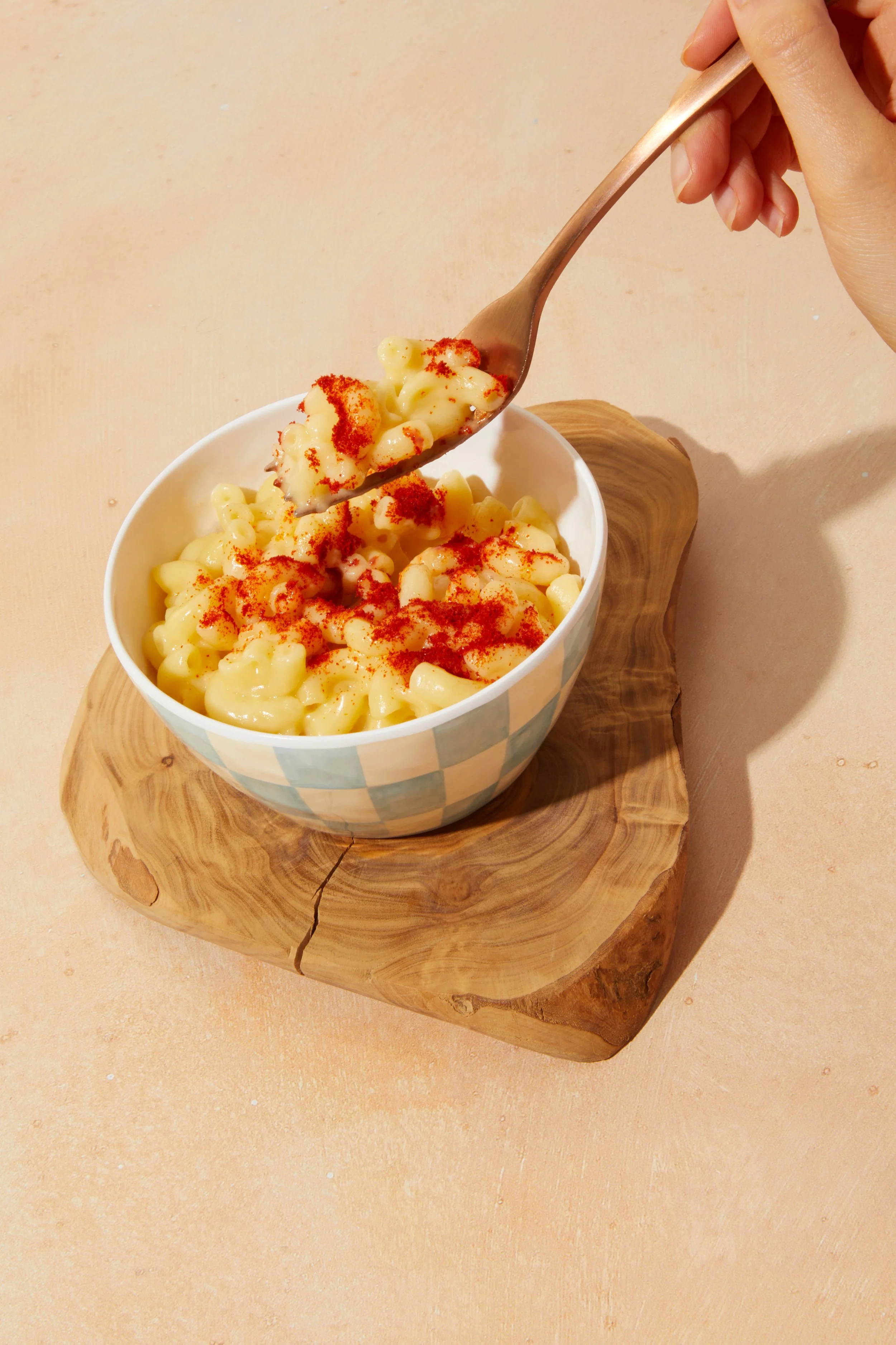
Branded photography became a pivotal design asset, setting the tone for both UI design and marketing strategy.
02- Design
Photoshoot Direction
User feedback and research indicated that strong, consistent visuals were crucial to establishing credibility and brand trust. Previously, we relied on doctored stock images to represent HOXY™—but this limited the brand’s ability to express its identity.
I collaborated with the business and brand strategy team to plan and art-direct our first official photoshoot. I developed a creative deck to communicate the desired visual tone, color styling, and composition. This direction allowed us to showcase the product in lifestyle contexts, highlight its versatility, and create a consistent brand narrative across the site.
Branded photography became a pivotal design asset, setting the tone for both UI design and marketing strategy.
The Final Design
The Final Design
UI Mockups
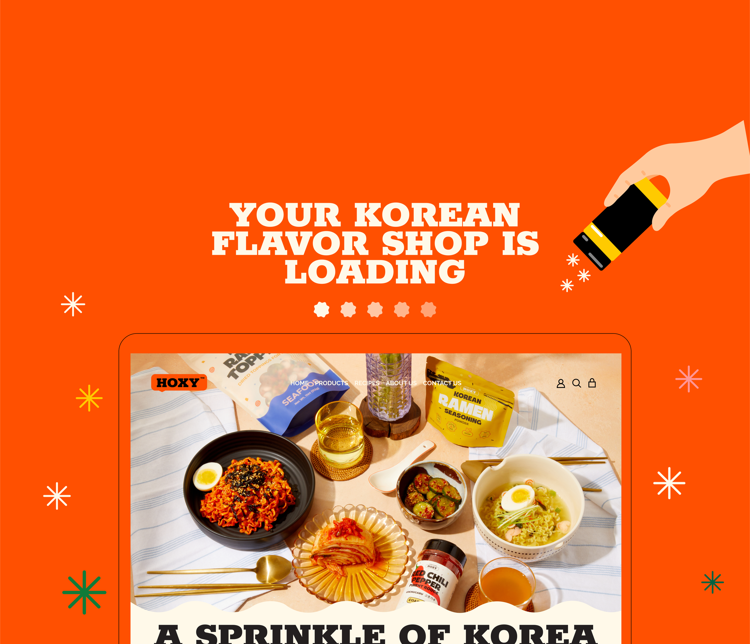
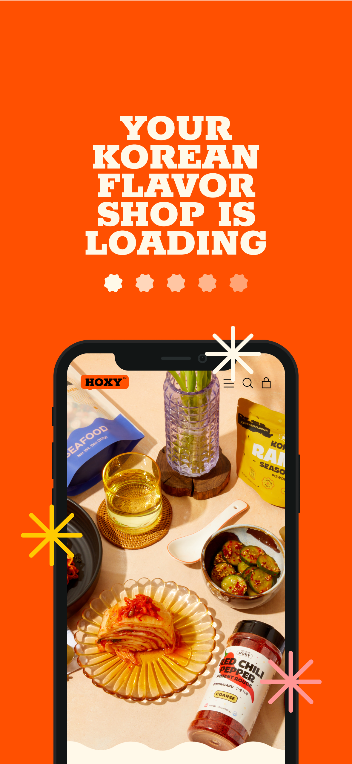
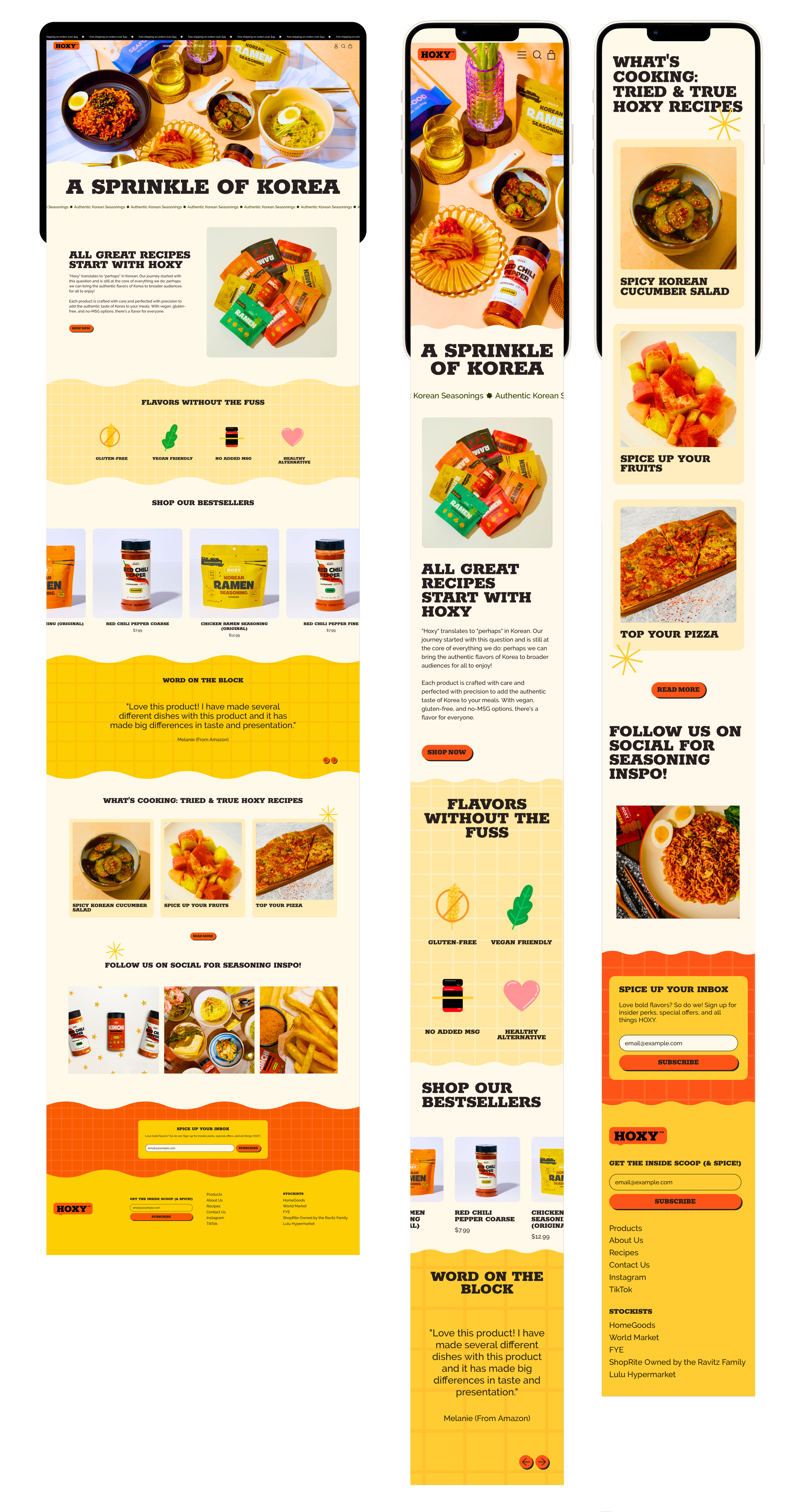
Landing Page
The homepage was designed to make a bold first impression. Rather than relying on lengthy copy, I prioritized large imagery showcasing the product and the meals it inspires. We are confident in the visuals and taste of the products, and we wanted the landing page to reflect that. This approach allows the visuals to communicate quality, flavor, and brand personality instantly—appealing to both returning customers and first-time visitors.

UI Mockups
Landing Page
The homepage was designed to make a bold first impression. Rather than relying on lengthy copy, I prioritized large imagery showcasing the product and the meals it inspires. We are confident in the visuals and taste of the products, and we wanted the landing page to reflect that. This approach allows the visuals to communicate quality, flavor, and brand personality instantly—appealing to both returning customers and first-time visitors.
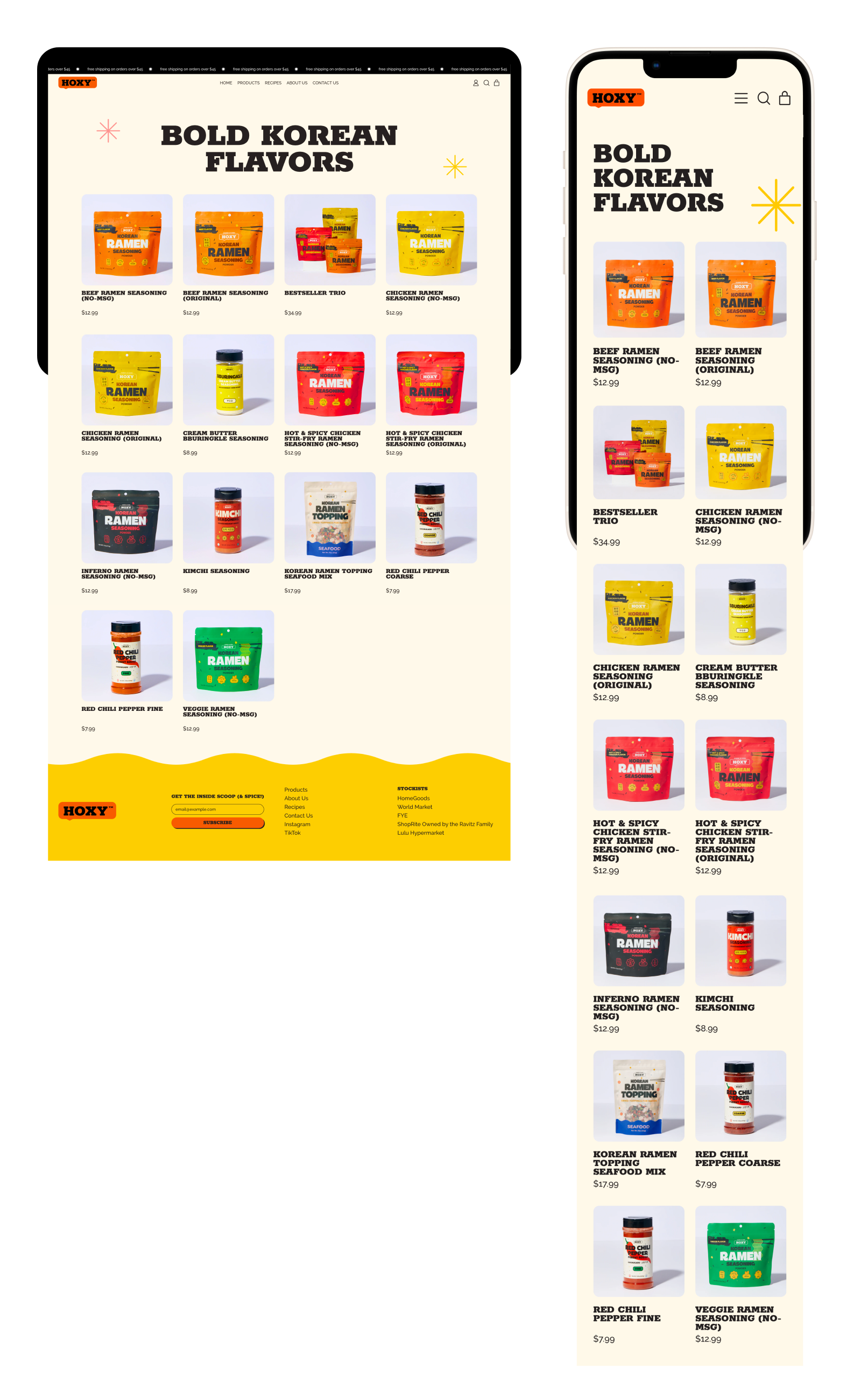
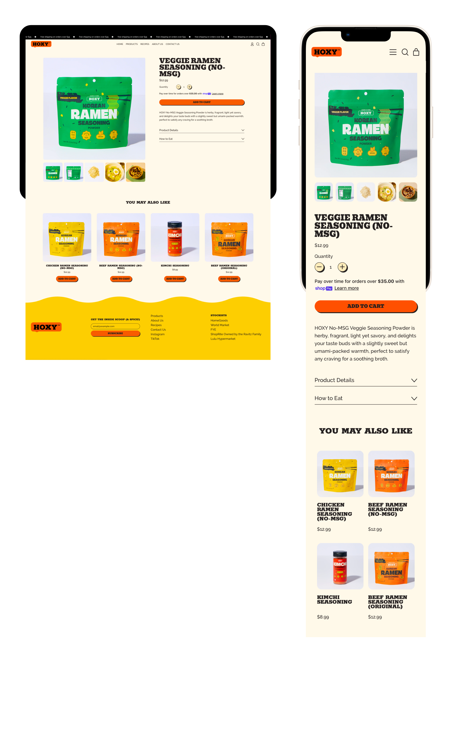
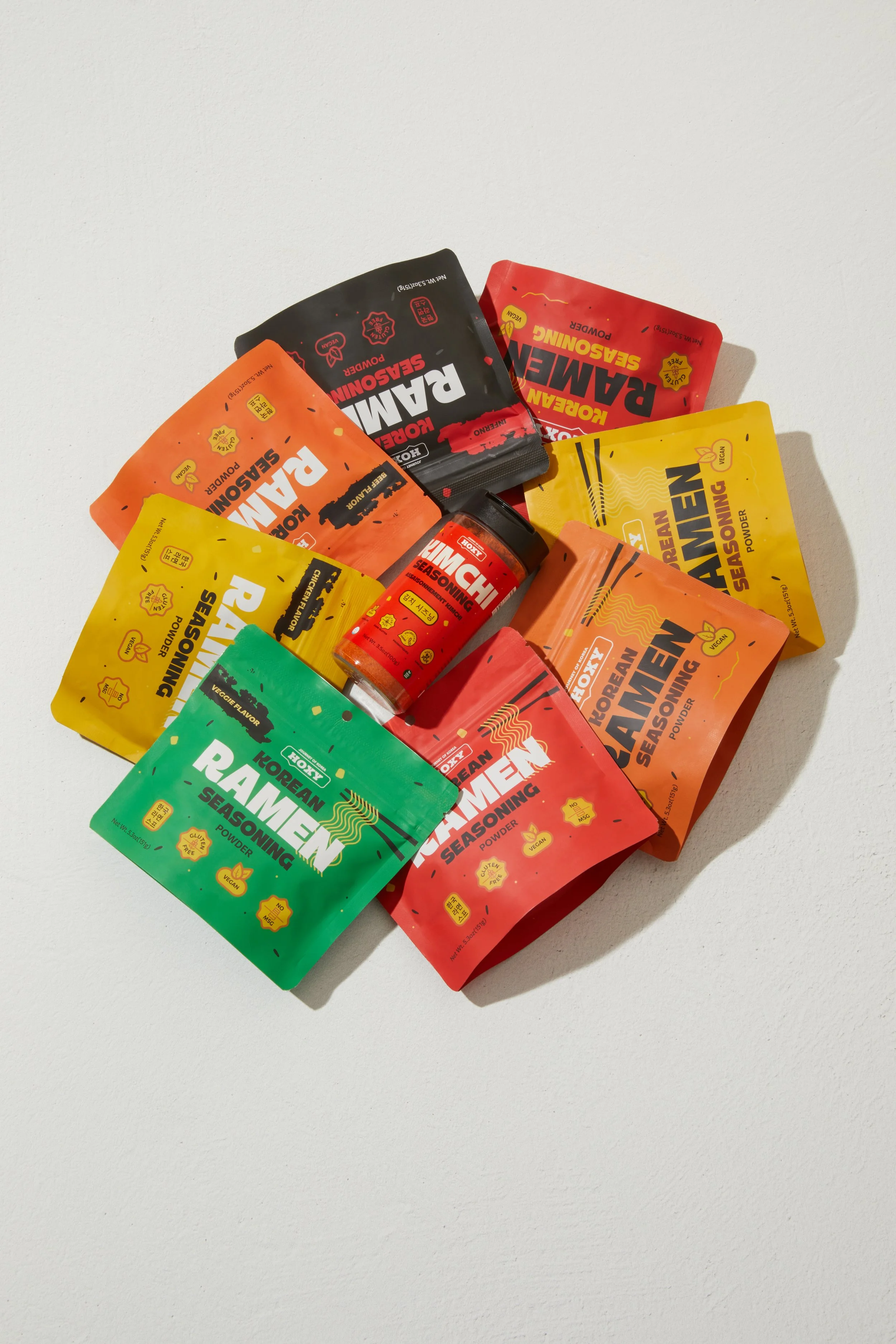
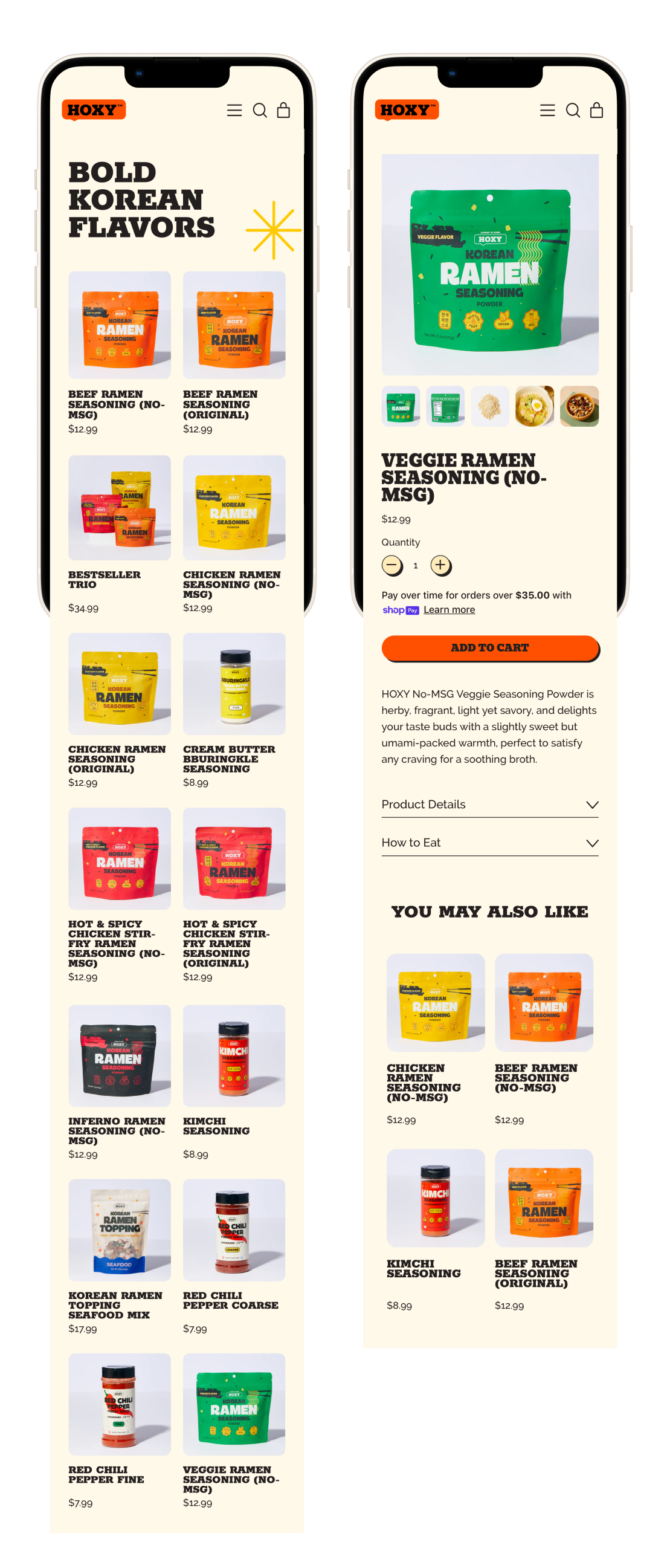
Product Pages
With a small but growing catalog, I opted for a unified product page that visually emphasized the colorful, cohesive packaging of HOXY™'s offerings. Each individual product detail page includes essential information: flavor profile, usage ideas, ingredient transparency, and related recipes—creating a frictionless, informative browsing experience.
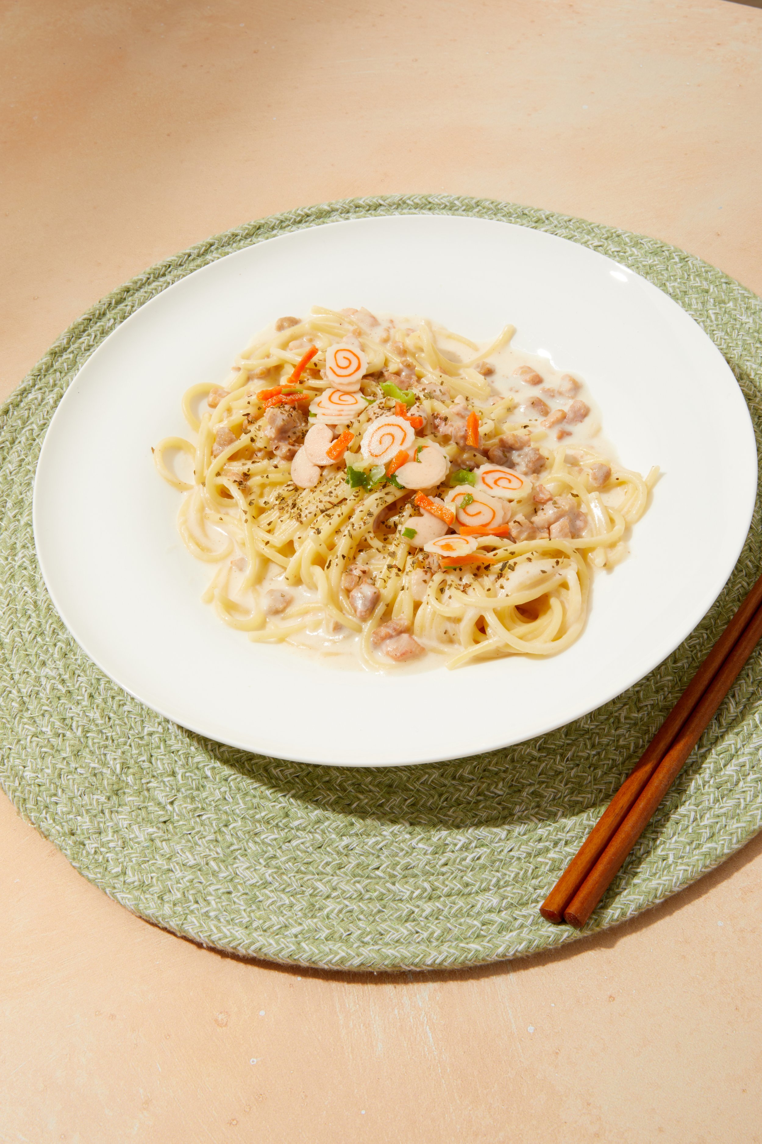
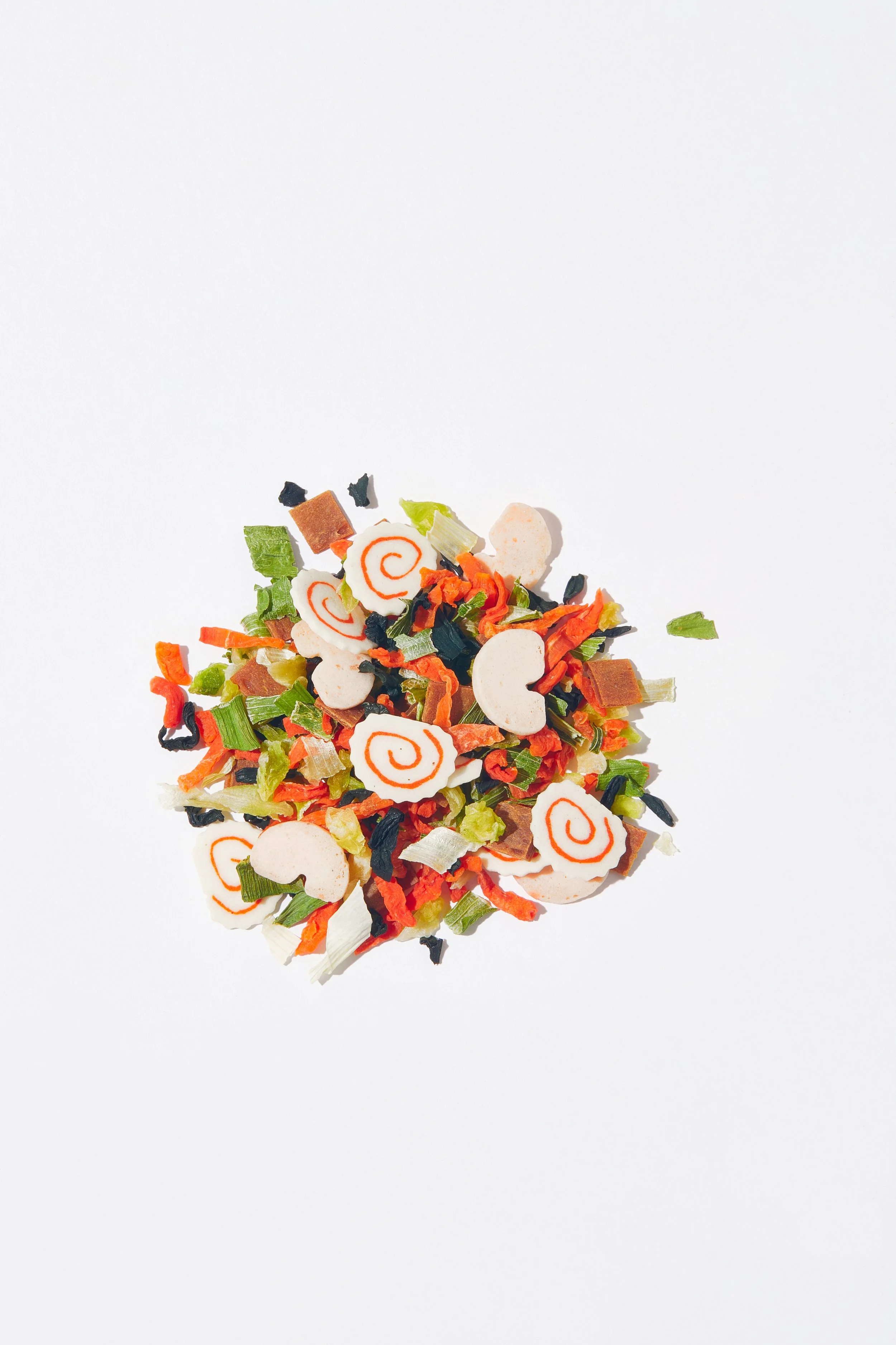
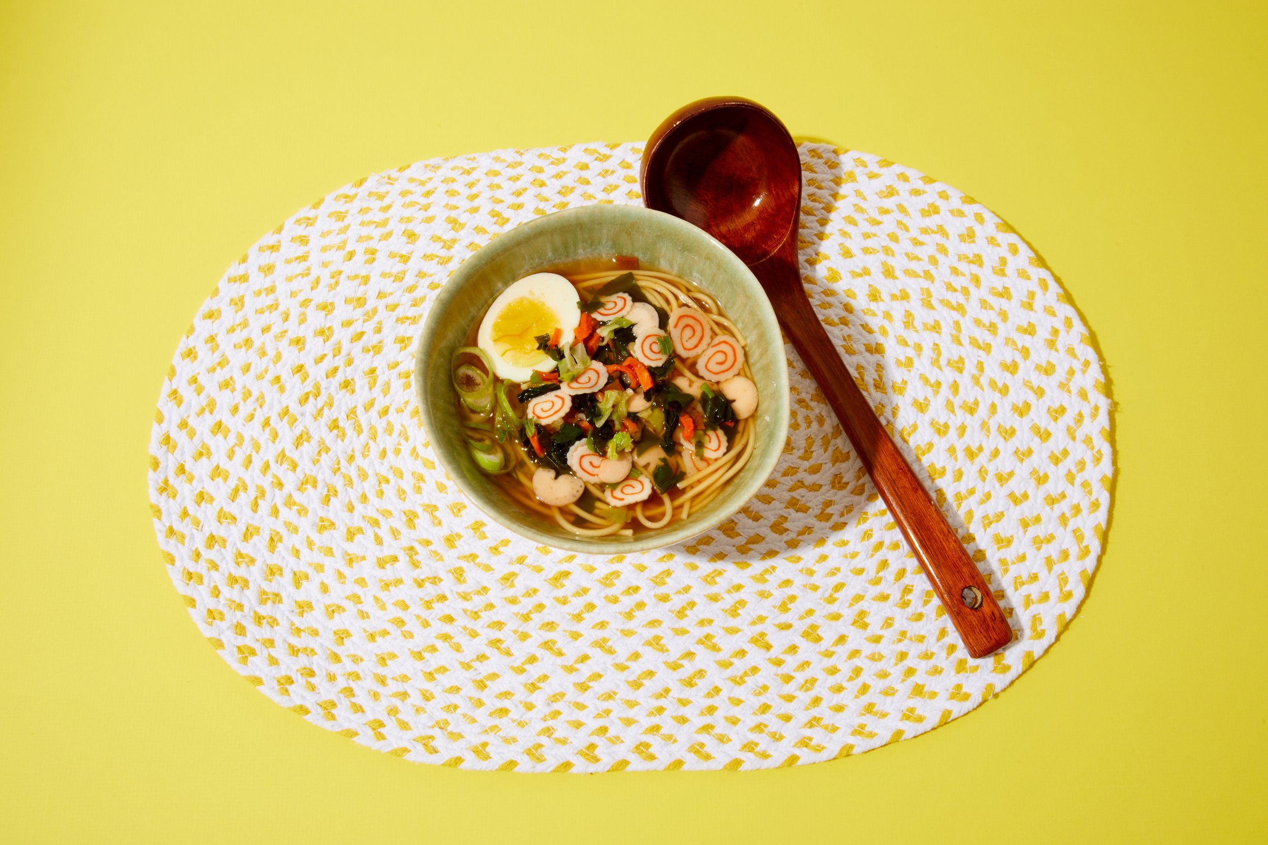
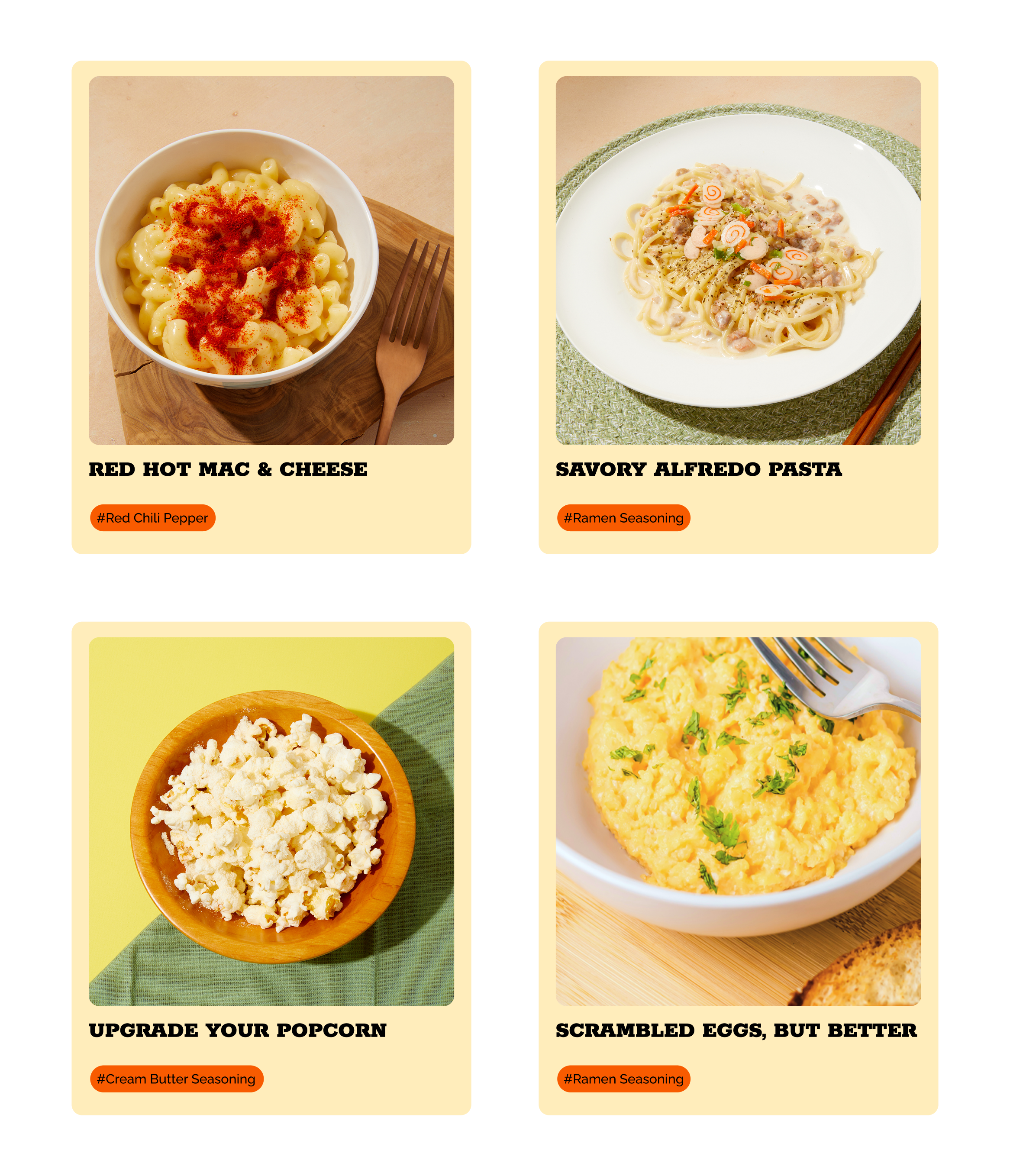
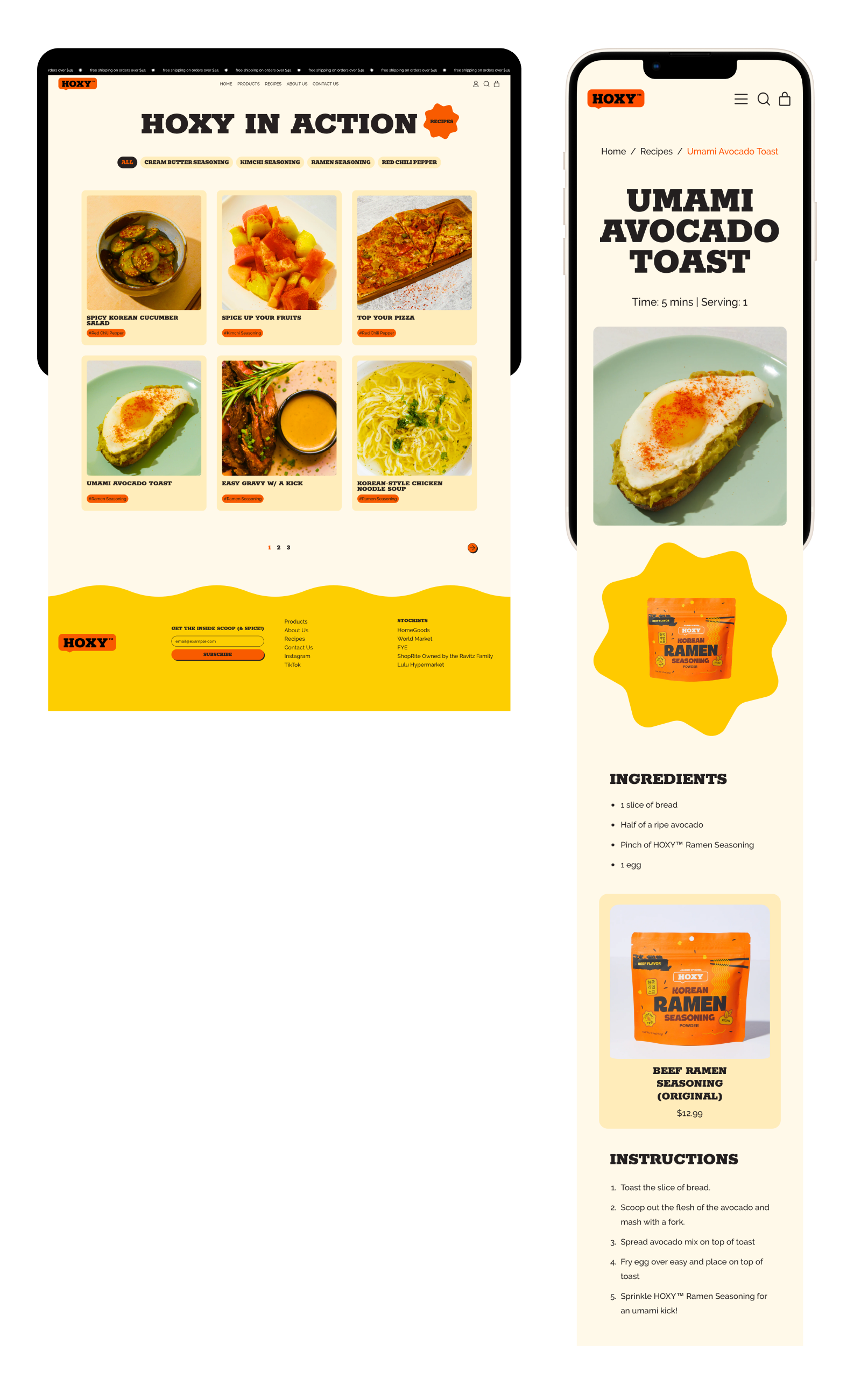
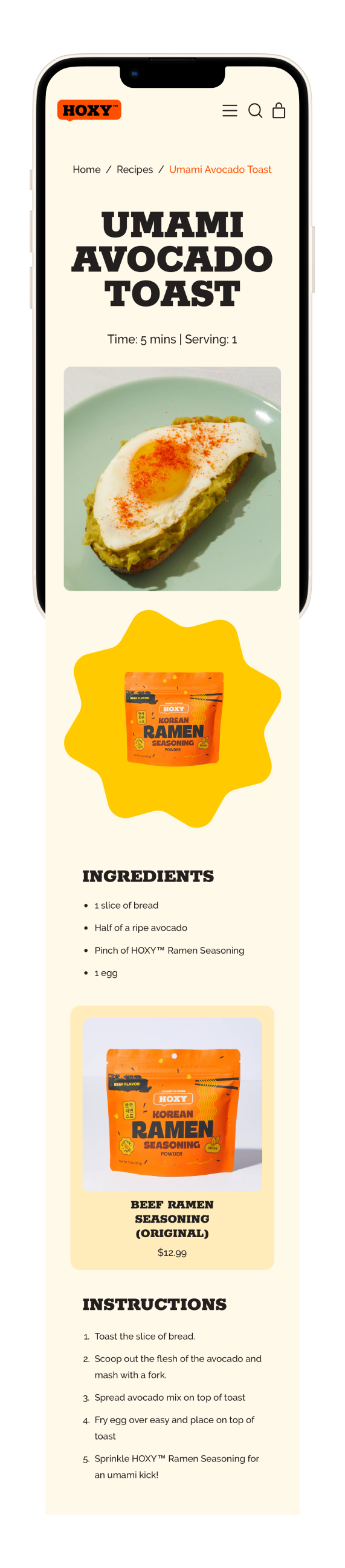
Recipe Ideas
One of the key insights was that customers want guidance and inspiration on how to use the product. The Recipes page acts as an educational and lifestyle extension of the site, giving users easy, practical ways to incorporate HOXY™ into their cooking. This builds confidence, drives product value, encourages repeat use, and serves as the first step in making the product theirs.
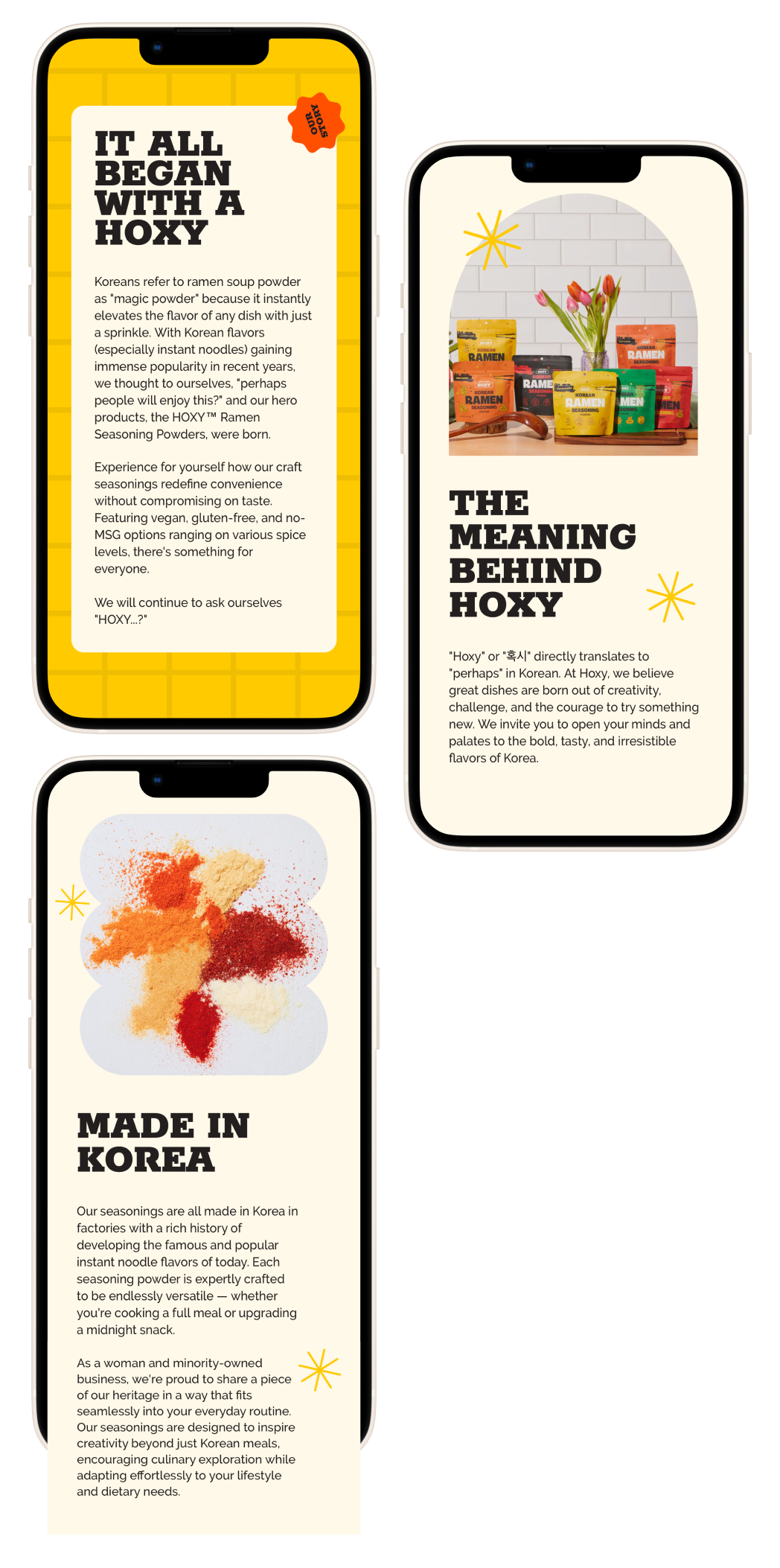
All About HOXY™
For small brands, it’s important to tell our story. Consumers care about the story of the brand and the For emerging brands, storytelling builds trust. The About page communicates HOXY™'s mission, the meaning behind the name, and the values that drive the brand. It adds a human element to the shopping experience, deepening emotional connection.
Reflection
This project taught me how much design is shaped by real-world constraints. While I began with a wide range of ideas, I had to adapt to platform limitations, development capabilities, and scalability concerns. I dabbled and familiarized myself with coding to ensure design integrity.
I also saw firsthand how cohesive visual systems and branded photography can dramatically elevate a brand’s presence. It wasn’t just about aesthetics, but how users feel and interact with a brand.